It is often said that if packaging design were a sport, it would be a decathlon. A very accurate metaphor, because professional designer must be well versed in materials, technology, branding, printing, ecology, industrial and graphic design, text advertising, layout, etc.
By analogy with decathlon types, the “food packaging design rules” can be renamed “10 commandments of packaging design”, which will help to effectively market the product they contain. So, this article will focus on the 10 "commandments" of packaging. Here they are:
- simplify and you will be noticed;
- communicate and persuade, not just inform;
- whet your appetite;
- take care of the environment;
- make the packaging easy to open and close if necessary;
- make the information block on the back of the package interesting;
- give the consumer RTB, "reason to believe," or USP, "unique selling proposition";
- exaggerate a little to get the consumer's attention;
- place ads on secondary packaging;
- be part of the whole, develop an idea or a product concept.
packaging design, and with the principles of creating a real masterpiece, and with the teamwork of the client and the designer, and with the task
designer to remove all unnecessary ...
1. SIMPLY
Three words to help make your packaging stand out in the populous supermarket world filled with thousands of products: SIMPLIFY, INCREASE and REPEAT! The human brain perceives no more than three messages at a time. The designer should be able to use this fact and prioritize correctly. You cannot increase anything until you reduce and simplify what is around. The main task is to convince the client. And this is much more difficult than writing an advertising message in which you can use psychology, give reasons and explanations, and this takes time. In addition, in order to achieve an increase in sales, it is necessary to influence any of the 5 human senses. Will it be touch (shape), sight (color), text or graphic design, or maybe sound, smell and taste? Most likely, it should be an unusual image or a very catchy shape. In the case of food cartons - and they all look more or less the same - it must be one of three things: brand, illustration, unique benefits.
But the question remains - in what order? It is known that our eyes (or rather, the brain) primarily react to color, which means that color is perceived more correctly with an optimal ratio of contrast and brightness. In the food industry, it is necessary to create an image of freshness, which is formed from the image of droplets, objects in motion and colors that cause
appetite.
The main thing that is important to pay attention to the attentive reader: “If you want your message to be noticed (that is, to be read, understood and remembered), do not load it with extraneous elements!". Leonardo da Vinci was absolutely right when he said: "All ingenious is simple."
2. CONVINCE, DON'T JUST INFORM
The packaging contains a variety of information. From the corporate brand to the content of the processed raw materials. From the type of cardboard to the type of printing - offset, gravure or flexographic. From net weight to website and more Let's take a look at the front side first. For example, information about the weight or volume of a product - 300 g or 330 ml - is boring for the consumer, and therefore he will not pay attention to it. But if you write, for example, "two large portions", the phrase takes on more meaning and increases the likelihood of making a purchase. Therefore the weight as well as the brand and logo the manufacturer, which symbolizes quality and is responsible for the degree of confidence in the product, is best placed on the back, the so-called informational side of the package.
- very appetizing illustration;
- correct price, regular or promo,
- an indication of the price-quality ratio;
- tagline;
- the nutritional value of the product, such as calcium for strengthening bones.
First, you need to understand that the information on a package of 50 g chocolate and on a bottle of yogurt are completely different things. Second, what we communicate to the consumer through packaging, print ad, website, and poster are also completely different things. Common sense should prevail here, which, unfortunately, is very rare in our time.
3. INCREASE APPETITE
To packaging appetizing, teamwork needed branding agency ... The goal is to pick the best ideas! But, branding agency is not omnipotent, and if the result does not meet expectations, it is always not his fault:
- the lithographer did not try;
- printing was done in a hurry;
- the buyer bought worse cardboard, etc.
- Don't be afraid of BIG images. There are FIVE REASONS for this: First, packaging with a large picture visually appears larger! Secondly, thanks to the LARGE image, all the minor design elements go to the 2nd plan, and therefore, the focus is not scattered. Third, among the huge variety, large pictures act as a beacon, attracting attention. Fourth, a large drawing is better remembered, and the consumer can easily find it on the shelf again. Fifth, if you do everything right, the product will be remembered. This is important because the consumer is always primarily interested in the product; brand, name, weight, etc. secondary.
- Interesting, beneficial lighting: brightness, contrast, backlight are important.
- Food styling: The art of making products look more appealing lies in the correct proportioning, cutting the lemon so that it does not lose its color, making the photo lively, not artificial, etc.
- Motion: Products in motion they look more appetizing than in static.
- Colors: Colors can be “edible” or “inedible”. Choose those that convey freshness, flavor, juiciness, etc.
- Take a cue from the masters: Today, the best food magazine is ELLE à Table (in France) and ELLE Bistro (in Germany).
- Food and people: Face will look very beneficial satisfied consumer... An excellent example of this are the advertising posters of the MAGNUM company.
- The basis on which the image is applied also matters. A picture printed on plastic will be more radiant than an image on paper, cardboard or tin.
- Appetizing Food: Many foods don't look very appealing (but taste great), so make them more appetizing by placing other treats side by side.
- Always consider natural size. Depict fruits and vegetables BIG, but don't overdo it.
- Make the food look warm (or cold): All food should essentially be warm, even ice cream! But if the main message to the consumer is freshness, you need to portray the droplets!
- Remember that the photo in the magazine and the image on packaging are not the same thing: a photo in a magazine can be saturated with various elements to create a certain mood, illustration on the packaging should be simple.
- A photograph is always more advantageous than even the most realistic drawing.
- Place a transparent window on the package, if technically possible. Most consumers want to see the product.
- Emphasize the main advantage: If this is the texture of the product, indicate so; if the taste of the drink - make the color a little more intense.
- Words should be “tasty”: choose only those that convey taste.
- Exaggerate slightly! Offer a little more than you actually have. If the subject of the picture is “GREAT TASTE”, the consumer is ready to experience it in advance!
4. TAKE CARE OF ECOLOGY
This concerns manufacturer, packer, packer, product distributor, distributor, and consumer... Speaking about ecology, we mean, first of all, the methods of obtaining and using energy, and here it is impossible to derive uniform rules for everyone, since they are due to:
- where you live (city or countryside);
- the political situation in the country: is waste incinerated for energy production (for example, in Denmark, Switzerland, Sweden, etc.) or is it buried, for example, in Great Britain and a number of other states, incl. and developing;
- the level of education in the country.
And if necessary, it closed again. Remember, visual appeal gives impulse for the first purchaseand the functionality is to repeat purchases! It has already been said more than once that many packages are too difficult to open, especially for elderly people who suffer from rheumatism, or simply people who do not have very strong hands. Let's make a reservation right away that there is a clear difference between packages that, for one reason or another, must be opened with great effort (child-resistant,
mishandling, etc.) and conventional packaging such as cardboard packaging for drinking products.
If the package is difficult to open, then it should have clear instructions on how to open it.
Here you can resort to "information design", That is, use symbols, simple words etc. It is best to combine short text with clear illustrations, on the principle of a comic strip.
6. MAKE THE INFO BLOCK INTERESTING
The front of the package should encourage buying - with the help of a competent branding, appetizing illustrations, special offer or product benefits. The task of the information panel located on the back or side of the package is to lead to re-purchase, i.e. establish a strong connection between the consumer and the brand / manufacturer. If so, why are the sides of the packaging often so boringly decorated that the consumer doesn't even look at them? There are five main reasons for this:
- Those who do this do not believe in the above, i.e. the fact that the information block encourages repeat purchases.
- The person who does this does not know how to use design make information more attractive, understandable, simple and interesting.
- Those who do this have no idea about the priorities, i.e. about which information is more and which is less important for the consumer.
- The one who does this chooses design firmswho know nothing about the art of communicating with consumers.
- Those who do this just don't bother!
- How to get the most out of the product, i.e. method of preparation and consumption.
- Contact the company for feedback, questions, more information. This can be a website on the Internet, an e-mail address, a postal address or a telephone number indicated in large print.
- What is the main nutritional value of the product, described in simple language.
7. GIVE A UNIQUE ADVANTAGE
One of the main promotional packaging functions - to convince the consumer that if he does not buy this product, then he will be missing something
important... Words, illustrations or just aesthetics work here design... To revive interest in the product, we updating the packaging design... There may be a lot of reasons - a new lineup, competition, new packaging material or, as often happens, a new manager has come! Then the following happens: the brand or product manager contacts creative agency with a request to change package designas it has always been and will be the most enjoyable experience for any marketer.
STOP! Before redoing package design, which is always costly and requires the involvement of third-party partners, try to think about CREATING an original "chip"! Something that will liven up the design, make a splash, amaze consumers and encourage them to buy! This "feature" should have an original graphic solution, nothing more interesting than another asterisk in the corner of the package. In fact, coming up with a "chip" is much more difficult and longer than just developing new design from scratch. After all, you have a limited field where you need to embed the key message and make it as large as possible so that it is conspicuous. Someone rightly remarked once that restrictions are conducive to creativity. Pascal said: "If I had more time, I would have written you a shorter letter." So what words, shapes and colors can impress a customer? Here are some examples:
- Become one of the true connoisseurs!
- Surprise yourself!
- Challenge your senses!
- Finally on sale!
8. EXAGERATE TO GET ATTENTION
If you are not noticed, you will not be bought! Everything is very simple! In order not to be missed in this life, you need to be different from others, to stand out from the crowd. You can achieve this through humor, style, looks, etc. The same goes for packaging... It is necessary stand out with designas most of the products are very similar to each other. The best and easiest way is to Slightly exaggerate any element of the packaging design, be it shape, color (s), size or material. Do not forget that you need to give the consumer what he wants, but he is far away the whole truth of life is not always needed... Let the bananas be yellower and the peas greener, it's not difficult at all.
What packaging - the largest format? The one that hits the shelves of retail stores? Not at all. This is a secondary (group) packaging that can be used only for its intended purpose, but can be turned into advertising billboard... You have 6 sides of a large cardboard box (of which at least four are clearly visible). And what do you print on them? Item number? Yes, if necessary. Logo? Yes, but really illustration not more interesting? Do you need a logo if you have a stunning picture? Of course not! The cargo does not always stand in the warehouse, it moves a lot. He is often "en route". In any case, you will have to indicate the article number, barcode and other necessary information on the box. So why not print ads as well? After all, this does not require large expenses. This is a way to advertise yourself well at no extra cost.
10. BE A PART OF THE WHOLE, DEVELOP AN IDEA OR A PRODUCT CONCEPT
Packaging it is often criticized as rubbish because consumers do not see the “big picture”. Being the most effective tool advertisingand, moreover, by the method of achieving synergy, the packaging is SAVING in its purest form! However, for this to happen, you need to think holistically. Packaging should not be viewed in isolation, overlooking other media such as points of sale, website, media... There is a widespread belief that the most effective way to reach a consumer is to follow instructions from a design guide (which usually includes several dozen pages) on how to properly use a logo, illustration, etc. The author of this article has a completely different opinion based on half a century of experience. creating packaging, point of sale registration and developing promotional material for consumer goods companies.
My opinion is based on 5 main points:
- the market situation is constantly changing;
- we are constantly learning new methods that help us connect with consumers;
- thanks to developing technologies, we constantly have new materials, means, and the like;
- what we thought was a good decision can lead to failure;
- all manuals and instructions are correct overall, but wrong in detail. It is difficult to find two identical markets.
And finally, the eleventh commandment. It sounds like this: "just do it"! Many thanks to Nike for this wonderful call!
Lars Vallentin, originally from Sweden, was educated at the Graphic Institute in Stockholm. In 1964, he joined Nestlé, Switzerland, where he was responsible for the development of creative design leading brands... For many young people in marketing, he has become a true guru teaching design, public relations and the art of making packaging worldwide. He is currently writing design books and creating packaging, lectures, acts as a jury member at several prestigious design competitions, and also consults companies that produce consumer goods... The basic principles that formed the basis of his ideas can be expressed in three words: simplicity, surprise and synergy.
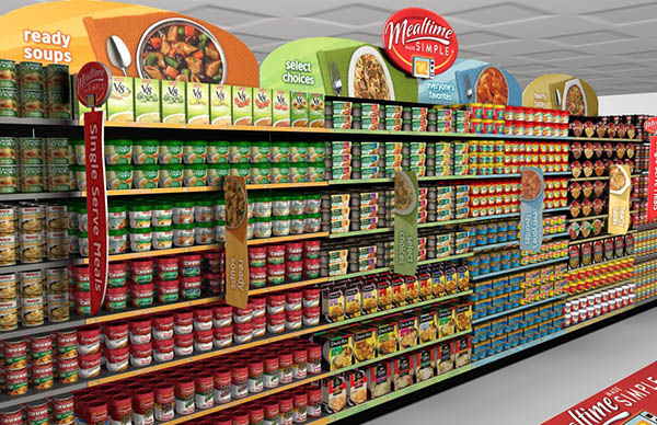
Retail is a battleground where brands battle for consumer attention. And the product packaging attracts this attention. The problem is that packaging holds interest for only two seconds, and then the person makes a decision - to study the product further or switch to something else. If the packaging design has not passed the two-second test, the advantage is given to the competitor who knows how to present the product to the buyer.
Less is more
In the modern culture of consumption, where the principle “the more the better” dominates, the idea that a laconic design can be very effective has been instilled for a very long time. However, experienced packaging designers have gradually embraced the Bauhaus philosophy in their work. Less is more helps reduce the time it takes for customers to evaluate a product's properties, so people can more quickly learn about the unique benefits of a product and relate those benefits to price.
Under the onslaught of flashy packaging and visual bombardment of promotional items, the average shopper only has two seconds to explore a product, and then their attention is distracted by a competing product on the shelf nearby. Therefore, it is very important to convey all key information about the product and convince the buyer to purchase it.
In order to fulfill this almost impossible requirement, designers often have to argue with marketing teams, study marketing materials, and browse catalogs of images created to promote a product. And it all makes sense, the only problem is that all the preparatory work was done in the quiet of the office and no one knows how the consumer audience will perceive the visual component.
The situation is complicated by the fact that the designer deals with content coming from 5-6 sources and each party is interested in implementing their ideas and each department wants to add something of their own to the "declaration of independence" of the product. By the time a designer has received all the content they want, they should have at least decided on the size of the main font in order to be able to fit the input of all teams into the space at their disposal. An experienced designer should also look for copywriters who understand how the "less is more" approach to packaging design works.

After all, the essence of this approach is expressed in the rule of two seconds. If the customer is able to assimilate all the visuals and textual content in such a short time, he subconsciously feels a sense of accomplishment and completes the interaction with the packaging. That is, the buyer “understands” the product, knows what need it satisfies and appreciates its simplicity. If it takes more time, the product is judged to be complex and incomprehensible, and attention shifts to competing products. The secret to successful sales is to get your product into the hands of the buyer before the competition. This is where the "less is more" principle comes in handy, as it increases the chances of a product being chosen first.
Inspiring touch
Oddly enough, but packaging for the buyer is an obstacle, and an unpleasant one. This is what stands between the person and the product that interests him. If such an opportunity existed, then no one would use the packaging - after all, it is much better if the buyer can touch, smell and taste what the brand has to offer. But alas, there are many health, safety and logistical constraints. However, the experienced designer always strives to minimize the clutter that prevents the buyer from evaluating the properties of the product.
For example, by providing the buyer with visual contact with the product through transparent zones in the package, you can significantly increase sales, since the information received is enough for the buyer to understand how the product looks like, what it looks like and matches its appearance to what is presented on packaging. If all fears of the buyer are eliminated, it is easier for him to make a decision to buy a product.


If direct access to the product is not possible, then you need to present it in the form of photographs on the packaging and try to make the buyer want to buy this product. Images should visually convey taste, color, smell, all efforts of the designer should be aimed at ensuring that the packaging interacts correctly with customers. The designer will challenge himself and do everything to make the packaging as invisible as possible. That is, remove the obstacle.
Opposites attract
Standing in front of a shelf in a store, the buyer examines the goods standing there, and at this moment a huge amount of information enters his brain. The visual scan time is estimated in milliseconds, which is very, very small if you consider the process from the point of view of packaging design.
The buyer's brain subconsciously searches for a suitable product according to two criteria:
- what is familiar to him
- what stands out
In repeat purchases, customers are looking for a product they already know a lot about. They have already bought it, they liked it and they want more. However, subconsciously, people feel that they would not refuse to purchase a similar product if its quality is even higher. And this is a chance for a packaging designer - after all, he has the opportunity to acquaint the customer with the product, making it stand out from the competitors. If a packaging designer can think strategically, they immediately come up with a design that does not compete with other products in the same niche. It makes a product stand out rather than making it look like other products.
Unfortunately, all too often designers have to deal with inexperienced businessmen or indecisive marketers who are trapped in the “be like everyone else” principle. The mentality of such clients makes them strive to comply with all current trends in the product category, instead of rejecting prejudices and confidently going to leadership. The desire not to stand out is very seductive, as it is safe. “If three other competitors use blue in their packaging design, then we should do the same,” the client thinks. And he is wrong. Product category leaders think differently: "If everyone uses blue, then we'll use red." Of course, all this is a simplification, but the principle is correct. Leaders do not worry about where competitors are going, they have their own path, as they are confident that the chosen direction is the right one. Imitators are not sure if their ideas are correct and this will inevitably affect packaging design.
Here's an example of eye-catching packaging. Buyers are used to the fact that juice packaging is usually white with bright fonts and pictures. Making the packaging predominantly black is a bold decision; such a product will inevitably stand out from the competition. It is not known whether he will become the leader of the product category, but it is for sure that customers will notice him.


They are greeted by clothes
A customer's interaction with a product on a store shelf is a bit like getting to know each other in a nightclub or other public place. People come together and evaluate each other, look at their appearance, manners, and pay attention to non-verbal cues.
All this is not enough to get to know another person well, but it is quite enough to get in touch. The process of evaluating the appearance is subconsciously included when shopping in a store. Just as a young woman is looking for a man suitable for her age and personal qualities, the buyer is looking for a product that matches his needs and feelings.
If a person is looking for entertainment for one night, he dresses brighter, but those who need long-term communication will subconsciously choose more modest clothes. It's the same in packaging design. No single product can meet the needs of all people. Not knowing this leads inexperienced manufacturers and marketers to make mistake after mistake when trying to create a universal product. Very often, in this case, the designer is tasked with creating a package that will interest everyone. Even if it is known that the goods are mainly bought by women, such manufacturers do not want to alienate the male audience and demand to create universal packaging.


This is mistake. A product that is created for everyone is often not needed by anyone and experienced designers know this. For example, if the average customer age is 18-30 and this is a woman, then you should take a closer look at the visual style of millennials. In this case, the packaging should be environmentally friendly and as natural as possible. If the target client is a man between 40 and 65 years old, then the designer needs to use large fonts, short and precise messages on the packaging, and more rigid packaging. Such a product is perceived as stronger and the buyer will buy it with a great desire. Packaging should be designed so that it fully meets the requirements of the target audience. Everything here is like in life: teenagers have their own fashion, young people have a different one. Middle-aged people dress differently, everyone knows that. Therefore, the packaging design must have distinctive features so that the customer reads the message and associates himself with this particular product.
Hello!
One of the ways to increase sales of an online store is to use the original packaging for the product. The original design of the box, label and other elements (for example, scotch tape) play an important role in increasing brand awareness and identification. Yes, creating your own packaging is an additional cost. But they will pay off handsomely.
Here's why.
Researchers have found that when a customer evaluates the product itself (especially at the first purchase), 70% of the experience depends on what kind of packaging they have.
Just one example. Nike launched the sale of Nike Air sneakers not in traditional boxes, but in a plastic bag, inflated with air.
Nike Air sneaker packaging
This packaging killed three birds with one stone:
- The company showed the product, literally, with its face: unusual packaging attracts attention.
- She emphasized the name Air, which is not just a beautiful word, but a designation of the special quality of sneakers - their "airiness".
- Made the delivery easier, since the sneakers have quite transportable packaging.
Your main task is to surprise the customer, make him remember your brand for a long time.
Shorr Packaging Corp has found that for more than half of its customers, individual packaging adds value to the product. The first impression about the product (and the seller) is formed in 100 milliseconds. It is the packaging that gives the customer the first tactile experience with your brand.
Another important point. Premium shoppers who spend hefty amounts on online purchases are 15% more likely to repeat purchases precisely because of the attractive packaging and the ability to use it for photos on social networks. Remember how, during the release of the iPhone X, empty smartphone boxes were actively sold on the Web. This is a good example when packaging worked for the image.
Thus, the creation of original packaging can be viewed not as another cost item, but as a marketing investment.
How to create the optimal packaging?
1. Determine what your target audience might like
You can develop an expensive super-box constructor, but it will be unnecessary for your customers. Your customers may be interested in the environmental friendliness of packaging, the ability to use it in everyday life, including for children's games, strength, which guarantees that the goods arrive safe and sound (this applies to fragile goods). Or, on the contrary, lightness: the ability to quickly open and dispose of the box.
The main thing is that the packaging evokes only positive emotions.
Those who decide to do business should have a special attitude to packaging. Develop form styleso that your boxes are recognized: then they will work for your image.
The packaging design can and should be changed: in accordance with the season, holidays, customer status (for example, for regular customers, you can enter "golden" gift boxes, and so on). This is a huge scope for imagination. The main thing is to choose the right direction.
Publication from Funnysocks.ru (@funnysocks_ru) Dec 14, 2017 at 7:27 PST
2. Calculate your budget
Calculate how much the original packaging will increase the price of your product. You might want to consider a side-by-side option: selling holiday packaging or construction boxes separately.
You can also pack the product in a "special way" as a reward: new customers, those who purchase products for a certain amount, and so on. But in this case, your packaging must have some value. The easiest option is to be functional so that the buyer can use it after receiving the goods.

A box that can be used as a jewelry box, designed by Gaba Guzik
The original packaging can serve as the basis for many promotions. Announce a competition for the most original photo with your box. Or invite your customers to show them how they use your packaging in their daily lives. Contests like this can easily go viral and quickly spread across social media. This is a great way to promote your brand.
Explore how other online retailers pack products. But don't repeat, do better! If it turns out that no one in your niche makes original packaging, manages with standard bags and boxes, you have a chance to win the eternal race for customers thanks to the facts voiced above.
In any case, don't go after super original designs. The packaging should have been logical. Bright or, on the contrary, pastel colors, fonts, pictures, form, original printing stamps, information posted: all this should be combined with the product, harmonize with it.

4. Consider how packaging can highlight the value of the product
You can place your slogan, wishes for the holidays, various appeals, useful information related to the product on the packaging. And even just a funny picture to enhance your mood. In any case, the main goal is for your customer to see the value of your product and forever associate this feeling with your brand.

5. Highlight the product's feature
As with the Nike Air, you can try to emphasize the features of your product. If the product is somehow related to the environment, use green colors. If you are selling something original, bright, you can play on contrast: choose a white or black box and play it up in an advertising campaign (discover brightness for yourself).
The first, and therefore the most important, consumer impression will depend on the packaging design. The label is the link between the firm and the customer, so it must be informative and effective. It should be clearly visible on the supermarket shelf, and its appearance should correspond to the inner content.
Creative label design, convenient packaging or bright packaging material are factors that ensure the success of the product and the brand as a whole.
Packaging requirements:
Memorability and simplicity
The buyer does not have time to look at a picture for a long time, consisting of a huge number of small elements.
Original form
Compliance with this condition ensures the individual perception of any brand.
Informativeness
When creating and developing a layout, this stage should be given special attention, since informative packaging gives the buyer the opportunity to get the necessary information about the product in seconds and quickly determine the degree to which it meets their own needs.
Emotional acceptability
An important aspect of branding. Experience shows that the majority of buyers when choosing a product are guided by emotions, and not a rational approach. Accordingly, color and graphic solutions are of great importance.
Legal (patent legal).
Checking the design at Rospatent (FIPS) and subsequent registration. After that, the customer becomes the sole owner of the packaging. Before ordering an original design, you should remember that it is important for a designer to be able to arrange the text compactly, to provide a stylish, complete look for the label. The correct presentation of information, the successful selection of the font and colors always attract buyers.
What should be the packaging?
- Attracting attention.
- Informing about the product.
- Emotionally positive.
What should you consider when creating your packaging design?
Cases:

"Miller" Beer brand
Task:
Competitive project. To develop a beer can design and advertising layout in the Miller style (limited edition for nightclubs).
Decision:
The design of the can and the layout is focused primarily on active young people who spend their free time in clubs.
The design is based on strobe lights that give the dance floor the energy of tireless movement, depicting the versatility of nightclub life. The slogan "Miller go beyond" is "Miller beyond."

"Lemonade" Natural lemonades
Task:
Design packaging for natural lemonades.
Decision:
To demonstrate the naturalness of the product, the label is made of transparent shrink wrap with an image of a fruit on a branch, as if it were dipped in lemonade. To reinforce the idea, the fruit is surrounded by bubbles. Warm colors have been chosen for packaging, yellow and light yellow-green colors evoke a feeling of lightness and sparkling. The emphasis in the package is placed on a photo of a fruit framed by leaves. For the name, a font imitating handwritten was chosen, which gives the packaging an emotion.

"Eco-farm" Farm milk
Task:
Design a packaging for farm milk.
Decision:
Developing a brand of natural farm products requires special attention. The packaging should emphasize the naturalness, lightness and freshness of the product. The developed milk packaging combines traditional and modern approaches. The ink-and-feather image of a cow emphasizes manual work and naturalness. The blue color scheme adds freshness, and the cohesive cow image helps to stand out and quickly count the goods on the shelf.

"Lampone" Syrups
Task:
Design creative packaging for raspberry syrups.
Decision:
The name of the product plays on the Italian word "Lampone" - raspberry, which is reflected in the series of flavors. The play on words is emphasized by the chosen package shape in the form of a large base lamp with a spring spoon, and a detailed label with engravings of berries contributes to the transfer of the consumer's mood of warm home comfort and inspiration.

"Orsk Myasokombinat" Premium stew
Task:
Develop packaging for premium stew.
Decision:
They were hand-drawn and stylized in an engraving style with images of animals. The shape of the coat of arms was used to emphasize the stability and reliability of the products. The front side of the package contains information that helps the consumer to make a purchase decision: GOST, the highest grade and the year of foundation of the meat processing plant - 1938. Black was chosen as the main color. To highlight the brand of the meat-packing plant, a red ribbon is used, which refers us to the heraldic images.

"Russian catch" Fish and seafood
Task:
Develop a trademark (name, logo) and packaging for seafood.
Decision:
We started developing the project more than a year ago, before the introduction of sanctions. Two concepts were proposed: "Russian" and "Norwegian" fish and seafood. We managed to guess the future trend and settled on the “Russian” concept. During the development of the name, about 300 variants were worked out. The Russian catch was chosen as the final option, as the company will produce seafood on the territory Russian Federation, in the most remote and clean places of the Russian seas. The name emphasizes this feature, it plays on patriotic feelings and inspires confidence in the consumer. In addition, domestic products are tastier and healthier, because they are less processed.
The advantages of the Z&G company. Branding:
development of non-trivial packaging;
international recognition;
the result in the form of packaging that increases sales.
If you want to know the price of a new design or redesign of existing solutions, please contact Z&G specialists. Branding. Packaging examples are presented in the Cases section.
Reviews:
Thanks to “Z&G. Branding "for the development of a label and a corporate character for KROKHA sausages. You met our expectations and offered a quality product.
Popok Daria, Head of Advertising and Trade Marketing Department, Cherkashin & Partner
We work with all regions of the Russian Federation: Moscow, St. Petersburg, Yekaterinburg, Kazan, Chelyabinsk, Perm, Izhevsk, Orenburg, Buzuluk, Samara, Saratov, Nizhny Novgorod, Tula, Voronezh, Lipetsk, Yaroslavl, Ryazan, Penza, Tver, Vladimir, Kirov, Volgograd, Naberezhnye Chelny, Cheboksary, Ufa, Kurgan, Tyumen, Surgut, Novosibirsk, Omsk, Kemerovo, Barnaul, Krasnodar, Irkutsk, Chita, Vladivostok, Khabarovsk, Yuzhno-Sakhalinsk, Krasnoyarsk, Rostov-on-Don, Kaliningrad and other cities of Russia.
Representative in Europe: Germany, Dusseldorf - Aachen.
P.S. Don't put off until tomorrow what you can do today! Submit your application right now
Hello!
Recently, looking through the archive of articles on the blog, I was surprised to myself to find that for 6 years I did not bother to write a single article on packaging designand. This is surprising because the topic of packaging design has interested and inspired me since my student days. But for some reason it didn't come to my mind to write an article or create lessons on this topic.
I decided to fill this annoying gap, and today I publish the first article on the topic. packaging design,in which I bring 6 rules for developing packaging designthat will make it attractive to the buyer. Read and comment!
How important is good package design for selling goods?
According to the Food Marketing Institute (FMI), there are about 40,000 products in the typical American supermarket. Thus, the $ 600 billion industry is entirely dependent on consumers, distributors, manufacturers and ... graphic designers.
Product packaging as a graphic design trend is an entire industry. International design agencies such as Landor, CBA'a and Coley Porter Bell employ hundreds of designers to exclusively design compelling and memorable packaging designs that will help grow and promote the brand.
Obviously, this is an issue that needs attention, so let's take a look at what makes good packaging design.
1. Simplicity and clarity
The next time you go to the supermarket, go to any shelf and see what is on it. Take a look at each product and ask yourself two simple questions:
- What is this product for?
- What brand is it produced under?
A great example of a simple, concise yet noticeable packaging design.
Believe it or not, it will be difficult for you to find answers to these important questions in the first 4 seconds, and this is how much time an ordinary customer devotes to each product on the shelf.
You will see products packed with different usefulness, but without a clear brand. You will see goods in a beautiful wrapper, under which you do not know what is hidden. For example, you may see cleaning products in packaging that are more suitable for baby juices.

it example of unsuccessful packaging! This cleaner looks too delicious, doesn't it? Such packaging can confuse the buyer, mislead him.
Of course, some categories of goods should be covered with an aura of mystery (for example, perfumes and luxury goods), but if you cannot understand what is in the package, you do not know what this product is for and under what brand it is produced, then this is a gross mistake of the designer. packaging that failed to complete its task properly.
So remember rule number one: the purpose and brand of the product should be obvious at first glance, literally “lie on the surface”.
2. Honesty
Newbies in packaging design - and we're talking about both customers and designers here - usually go out of their way to present a product in the most favorable light possible. They will draw you a cookie soaked in chocolate, but in reality you will get a cookie with a chocolate flavor. They will draw you yoghurt with delicious fresh cherries, but in reality it will be regular flavored yoghurt.
By describing a product ten times better than it actually is, you deceive and disappoint the buyer. Ultimately, this will reduce sales and very badly affect the brand's reputation.

Perhaps these buns are delicious, but the packaging is clearly not true.
This is where the question of honesty comes in. The consumer has nothing against simple inexpensive goods if he knows what he is buying! Yes, you can slightly "correct" the appearance of the product, but not to such an extent that it turns into something completely different.
You are a designer, and your task is to present the product in the best possible way, but do not forget that consumers - you, by the way, also belong to them - deserve honest treatment.
3. Authenticity
Originality, character and memorability are the foundation of a good brand and quality packaging design.
It's not hard to see why. There are hundreds of products on the market today, all competing for consumer attention. The only way to make your brand stand out is to make it authentic, different from everyone else's.
Since this is purely a matter of creativity and personal exploration, it is impossible to give any advice on how to “become authentic,” especially today with a myriad of brands, packaging and temptations available to consumers.
This design is fromColin Porter Bell Is a great example of authentic and memorable packaging.
If you cannot refuse the typical packaging design, then try to dilute it with bright visual accents.
For example, if everyone is into photography, use illustration or typography. If everyone is using a horizontal layout, use a vertical one. If most designs are done in modern style, try adding retro elements and focus on quality appeal.
Be smart, don't be afraid to stand out, and look at other product categories for unexpected sources of inspiration. By the way, labels on bottles with alcoholic beverages will surely push you to some "crazy" idea, which - what if? - will love your project manager for packaging design for a new brand of chocolate.
4. Efficiency of product display
When viewed from the perspective of the buyer, the product is always perceived in the bulk, as if blurry. Since we pass at some distance from the shelves, on which various products are laid out in rows and columns, all we see are colored kaleidoscopes. And so on until some detail attracts our attention and we do not want to come closer.
The visibility and attractiveness of a product on the shelf is due to the "efficiency of product display", on which its sales directly depend.
This is what you see in the supermarket. Which product grabs your attention in the first place?
You need to experiment with the efficiency of product display, you must not forget about it while working on draft packaging layouts. To appreciate the attractiveness of a design, place the product on the shelf and surround it with other products (for best results, you will have to lay out several rows and columns of each product). The more your packaging stands out, the higher your product sales will be.
You will be amazed at the results! Sometimes a beautiful and bright design simply dissolves and becomes invisible, while a simpler version literally catches the eye.
5. Brand expansion
A product packaging design concept should include the ability to add a new variety or even an entire product line or sub-brand.
Imagine you are designing packaging for a new brand of apple juice. You and your client choose the option with the image of apples, which look very appetizing. After a couple of months, your client suddenly decides to launch cherry juice under the same brand.

Well thought out packaging design allows you to make adjustments without losing visual appeall.
To your dismay, you realize that the original design concept that you've been working on for so long is entirely about apples, and that cherries don't really fit in. In addition, you need to write something about cherries on the label, which is contrary to the idea. So, you have a brand expansion problem.
To prevent this from happening, you should always think about the packaging of the product with an eye to the future. This means that you have to come up with a visual design for the product that is easy to change. Then you end up with a whole line of pretty and attractive products.
6. Practicality
Practicality refers to the shape, size and functionality of a product's packaging, rather than its wrapper or label. The more practical a product is packaged, the higher its sales. For example, when Heinz put a bottle of ketchup on the lid, sales skyrocketed.

By turning ketchup packaging technology upside down, Heinz continued to grow profits even during the crisis in the ketchup industry.
Practicality is most often forgotten during packaging design because customers tend to opt for the "time-tested" option, thereby depriving the designer of the opportunity to bring something new.
But if you are lucky enough to be given a chance to come up with a new generation bottle or box, always think about practicality first. In other words, think about how to make the product easier to use, carry or store.
It is practicality that will help solve a lot of problems related to packaging design.
The curtain
Package design Is a vast and important industry that always requires specialists who can make a product original and improve its sales. Packaging is the last call the customer sees and the last chance to convince him to buy the product. Clarity, honesty, authenticity and the other rules listed above play an important role in this process, but by no means are they the only topic that should be discussed when studying this area of \u200b\u200bdesign.

 Self-development


